Getting Started with EnviroData#
Introduction#
Welcome to EnviroData! Let’s get started by going through an example. We’ll walk through the basics of using monitoring stations in this tutorial.
Summary: Getting Started with EnviroData
The landing page provides an overview of monitoring locations and latest import events
Customize monitoring location summary pages to display relevant information
Use the sample analyses tab to access station data and quickly generate graphs or download excel reports
Use filters to specify date range, media type, and analyte selection when accessing data
Compare analyte concentrations with guideline standards
Use the tabular view to monitor data, add flags or change other metadata values
First Steps#
Your first step is logging in. Navigate to the EnviroData Login Page and enter the credentials for the Hatfield Demo account that were provided to you.
Once you’ve done this, you’ll be redirected to the EnviroData landing page. This page provides you with an overview of some important items. Take a moment to look over the UI and familiarize yourself. We’ll dive into the details of each of these as we go through the tutorials.
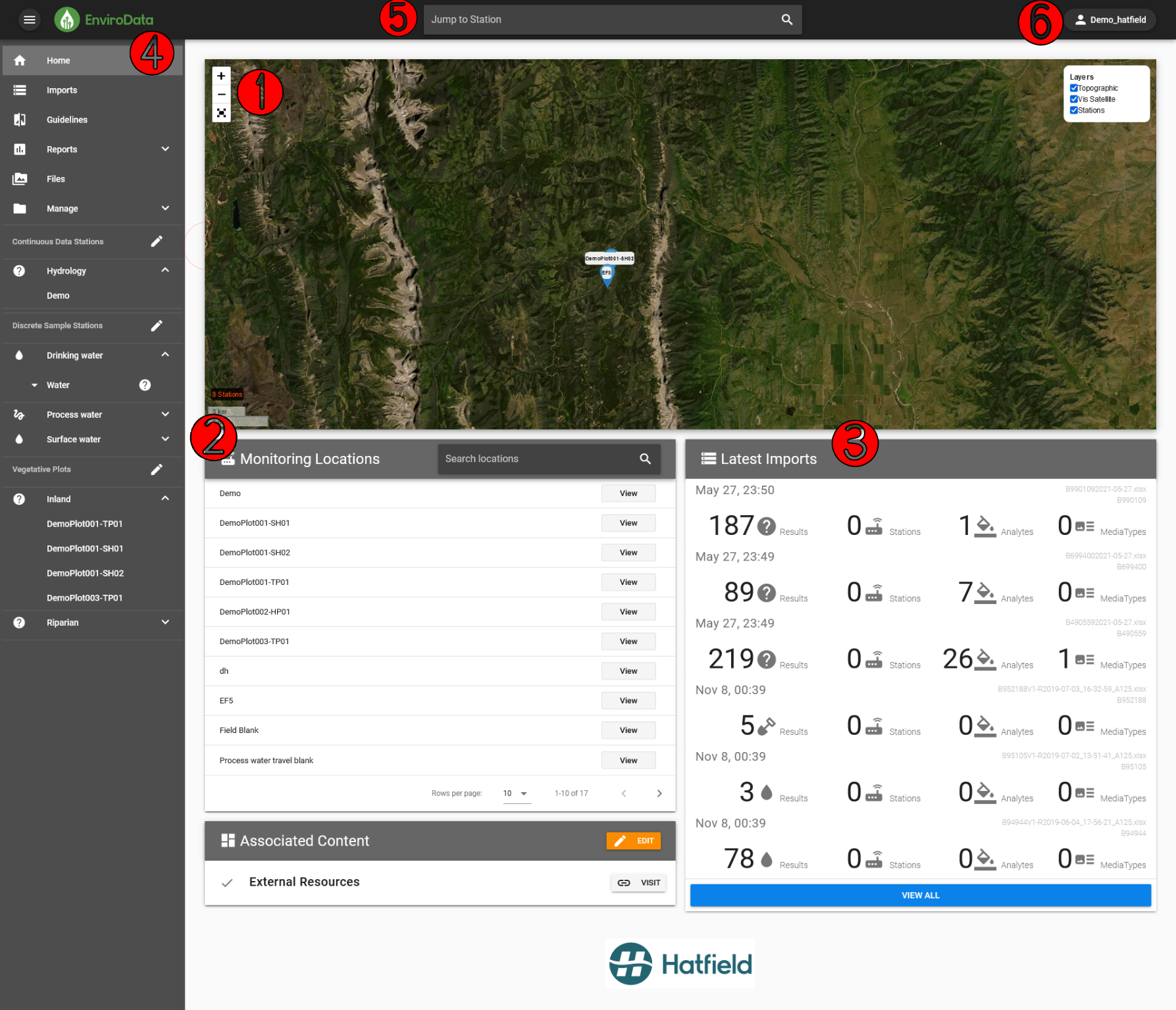
1) Station Map - Interactive map of monitoring locations.
2) Monitoring Locations Table - A list of active monitoring locations.
3) Latest Imports Table - A list of the most recent import events, indicating the number of new results, stations, analytes, and media types added to the database.
4) Side Panel - Links to the various pages of EnviroData. There’s a lot here! For now, you should just know that the top portion contains links to various management pages, while the sections below this contain links to Continuous Data Stations, Discrete Sample Stations, and any other stations containined in your account.
5) Station search bar - Quickly access a station by name.
6) Username - Click here to log out of EnviroData.
Let’s begin exploring EnviroData by taking a look at one of its most fundamental features: monitoring locations.
Monitoring Locations#
EnviroData groups all data and information related to a single spot into monitoring locations (also called stations). Monitoring locations are categorized based on their data’s sample media (e.g., drinking water vs process water) and whether the data type is discrete or continuous. In this tutorial we’ll focus on discrete monitoring locations, but know that much of what you’ll learn applies to continuous data monitoring locations as well.
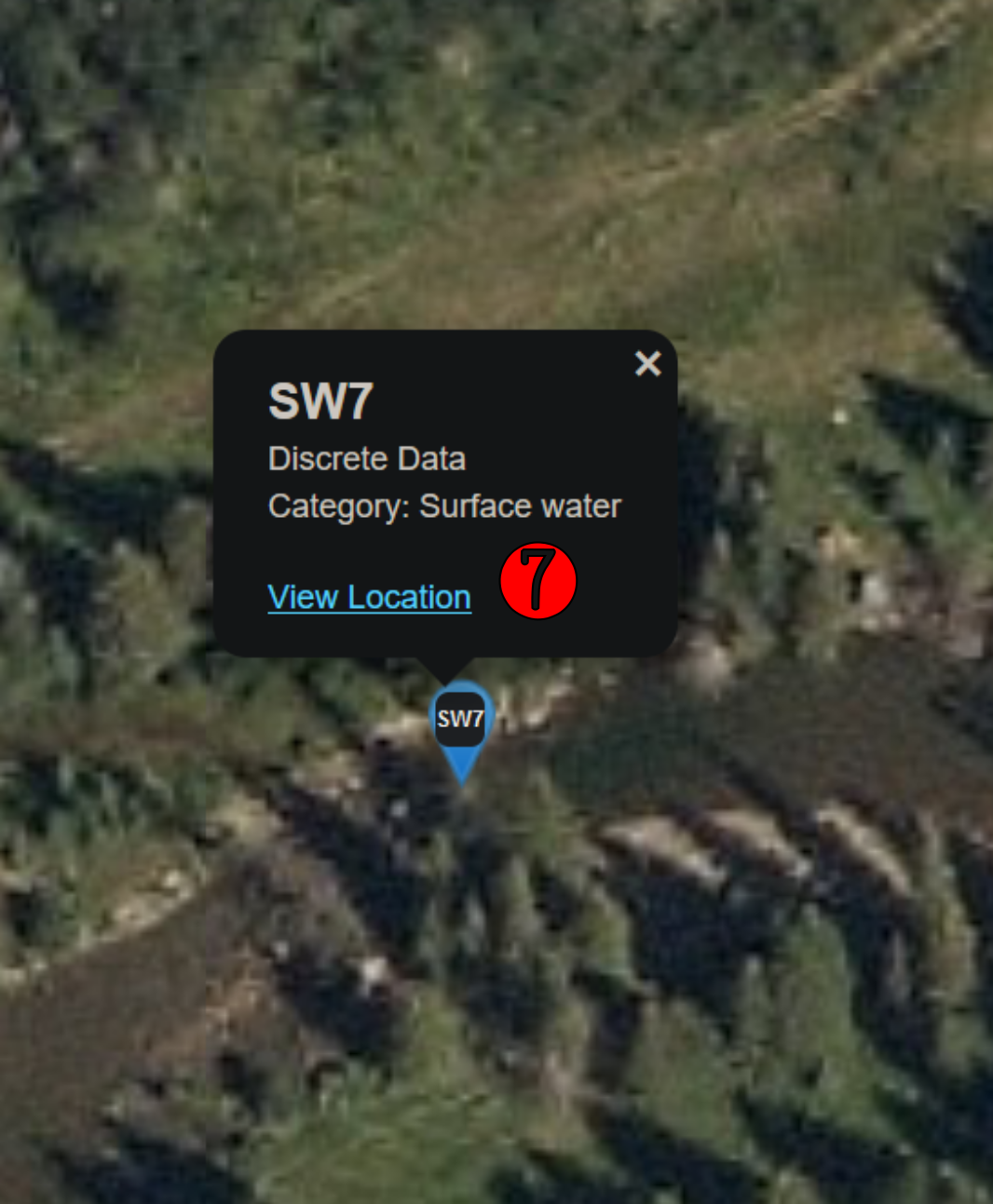
Move your cursor over the station map and zoom in on the blue markers. Click on the blue marker that says SW7. A tooltip will appear telling you that this station has discrete data of surface water samples. Click the View Location link to travel to the monitoring station’s summary page.
Each monitoring location has its own summary page where you can view related information, access data, and perform basic QA/QC procedures. Take a moment to become familar with the various components. The image below should help.
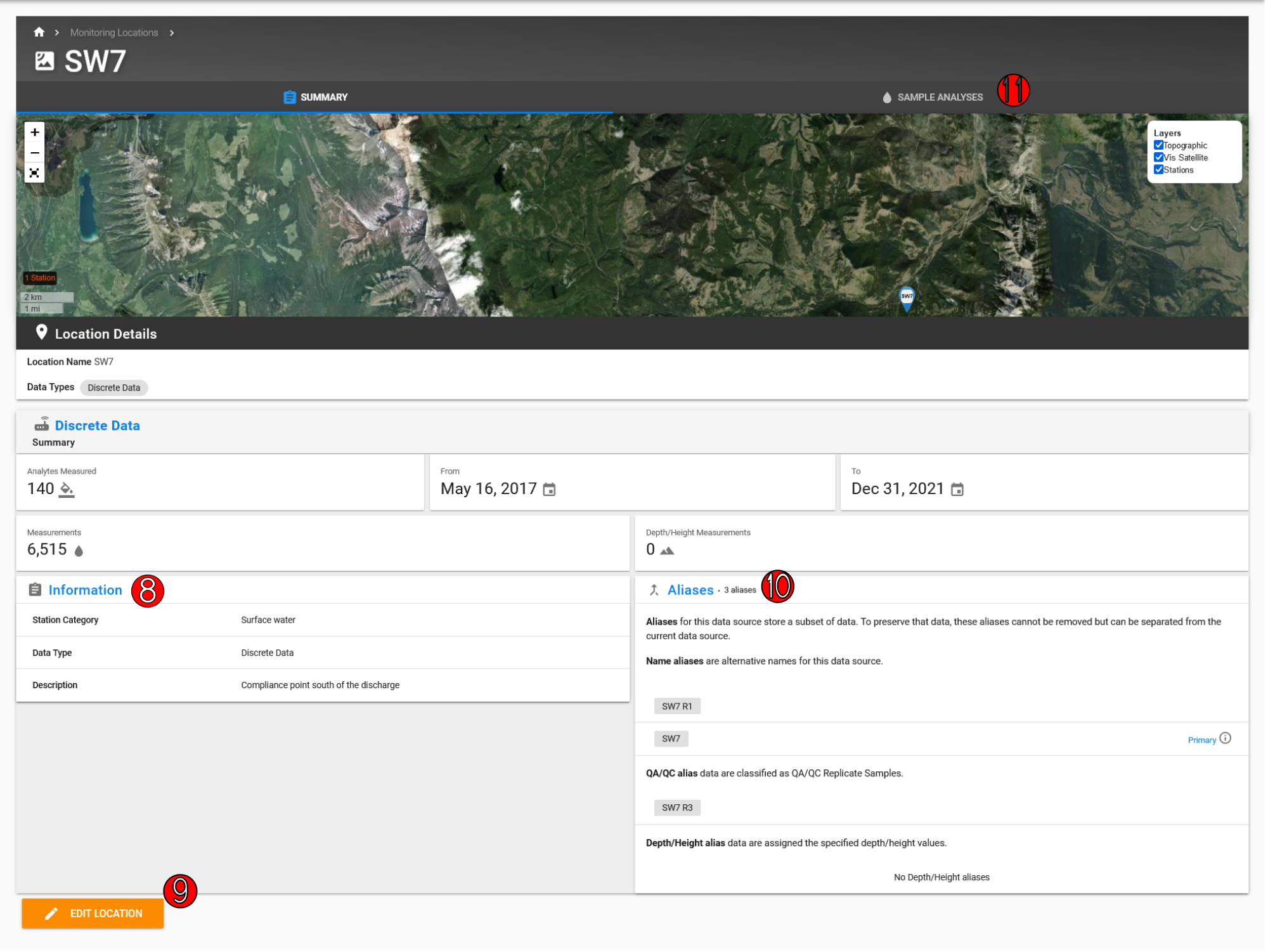
The summary page provides us with an overview of the station. According to the description provided in the Information card, this monitoring location is a compliance point south of the discharge. Above the Information card, we see more info icons stating that this station has 6,515 measurements for 140 analytes dating back to May 16, 2017.
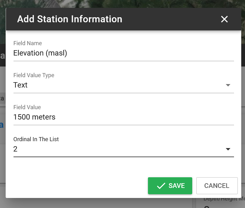
You can add as much information as you’d like to the Information card (8). For example, use the map to determine the station’s elevation by unchecking the Vis Satellite layer (if you’re in a rush: the elevation is ~1500m). Armed with more info, click the orange EDIT LOCATION button (9) in the lower left-hand side of the page. Then click the green +ADD button on the Information card. A modal will appear. In the Field Name field type “Elevation (masl).” Then type the correct value into Field Value. Finally, select “2” for the ordinal in the list to make it appear as the last value in the card. When you’re all done, hit Save.
The final piece worth pointing out on the monitoring location summary page is the aliases card (10). We’ll come back to this in another tutorial, but be aware that this station has two alias names for its data source: SW7 and SW7 R1.
For now, click on the Sample Analyses tab above the map and continue on to the next section (11).
Samples Analyses#
Let’s imagine we want to know the level of fluoride in the surface water at this station. First, switch the Media Type from Soil/Sediment to Water by clicking the radio button on the Media Types card (12 in image below). This will update the Analytes card (13) to show only water sample analytes. In addition to display name, the Analytes card shows the date of the first and last datapoints, as well as the total number of records. Select fluoride by clicking the checkbox next to the “Fluoride (F)” analyte.
Tip
The analytes list is ordered alphabetically. Either use the arrows on the lower right to scroll to fluoride, or simply search for fluoride in the search bar.
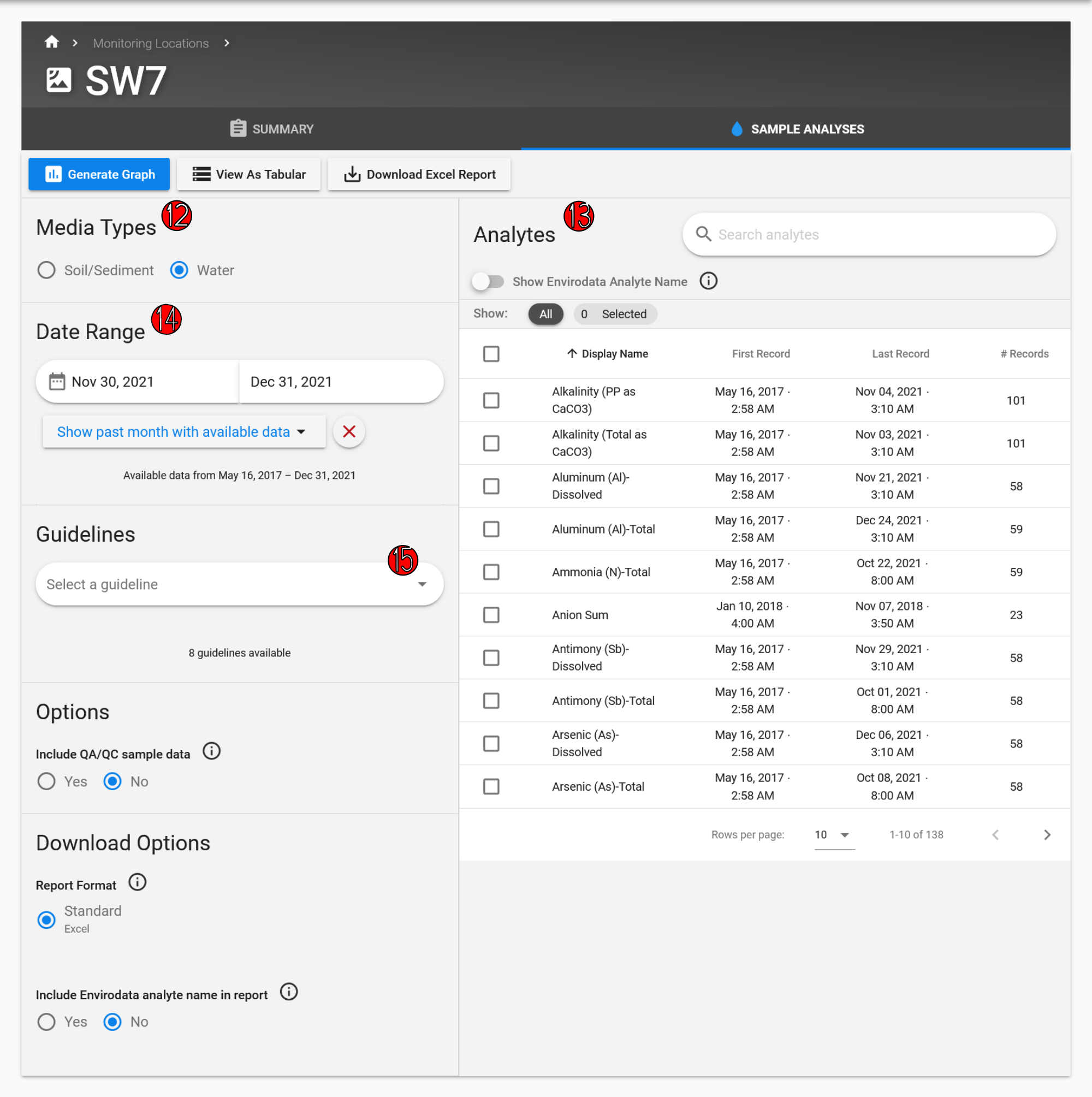
Next, ensure that Show all available data is selected on the Date Range card(14). Once you’ve done this, hit the blue Generate Graph button.
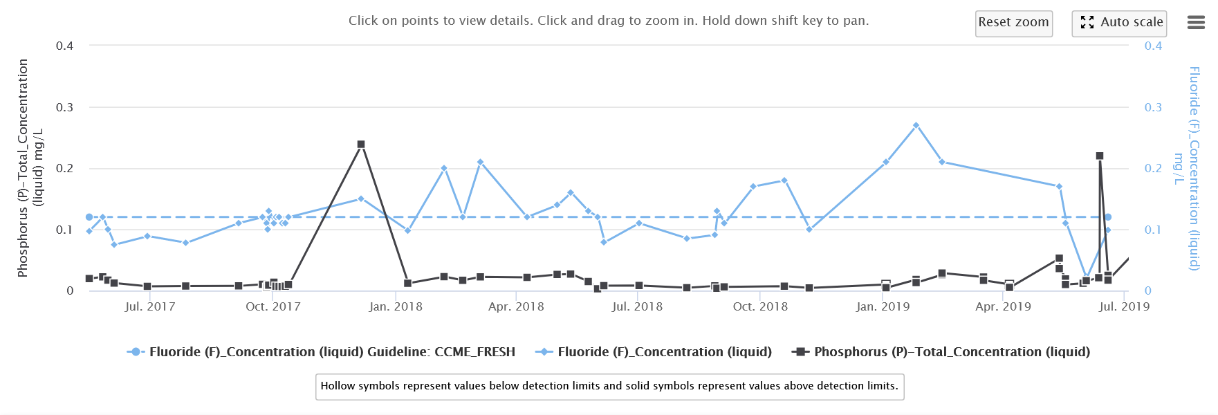
You’ll note that a maximum was observed sometime in January, 2019. Click on the data point to view the details of this observation.
The resulting tooltip provides information about the date of analysis, the concentration, the detection limit, the COC code for the file from which the datapoint comes, as well as links to the import details and source file.
If you’d like you can click on the Import Detail link, but we’ll explore this page in the next tutorial.
Now imagine in addition to fluoride, you want to see what phosphorus concentrations were like over the same time span. Clear the search bar if you used it earlier and type phosphorus.
Tip
You can add up to 5 analytes at a time on discrete sample graphs.
Finally, let’s compare the fluoride concentration to a guideline. For this example, we’ll compare to the Canadian Council of Ministers of the Environment Freshwater Guidelines. To do this, click the dropdown menu on the Guidelines card (15) and select CCME_FRESH. Then hit the blue Generate Graph button once more. You’ll see a third dashed line appear on the graph, which represents the guideline value for fluoride.
Below is an example of what your graph should look like by now.
Tabular Data#
Next we’ll take a look at the tabular view of datasets as well as some of the actions we can perform with them. To do this, first clear out the selected values and select Antimony (Sb)-Dissolved. Again, ensure that Show all available data is selected. Then hit the View As Tabular button (near the blue Generate Graph button).
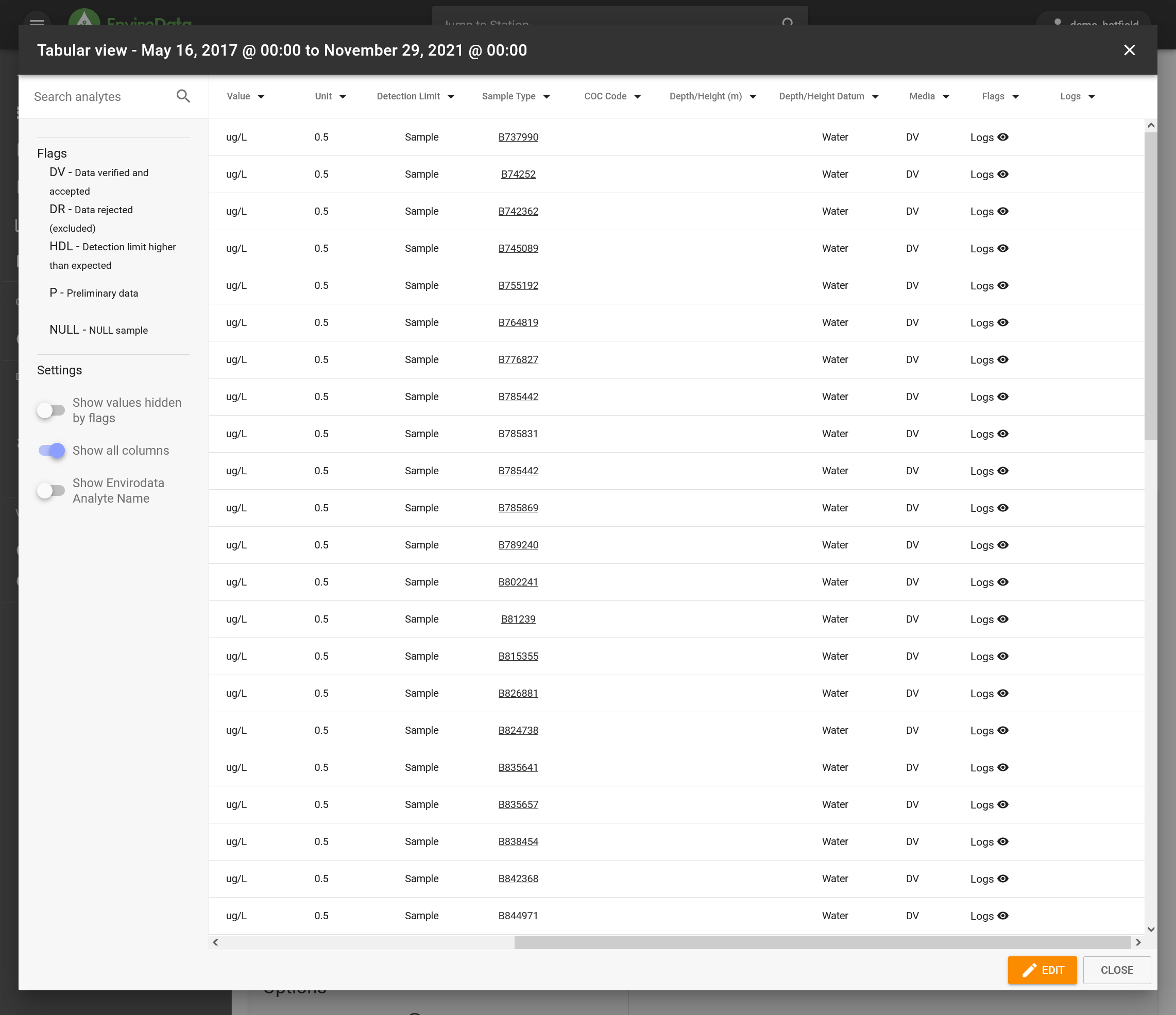
The tabular view provides a spreadsheet of information for each selected datapoint. EnviroData allows you to add QAQC flags to your datasets. Take a look at the flags column by scrolling to the right. Note the Flags Legend on the left hand side of the monitor which tells us that the DV flag means these data points have been verified and accepted.
Next, click the DateTime column to re-order the datapoints as descending, such that the newest datapoints are displayed at the top. You’ll note that these datapoints are marked with a P flag. This means the data is still preliminary because it was recently imported. We’ll set these values to DV now that you’ve looked at them.
To do this, first hit the orange EDIT button at the bottom right of the spreadsheet. You could select each datapoint that you want to flag individually, but a faster way is to use the filter function. Click the little black arrow on the Flags column title. In the Filter by values box first hit CLEAR and then click P, then select each of the resulting dates that are shown followed by the UPDATE button.
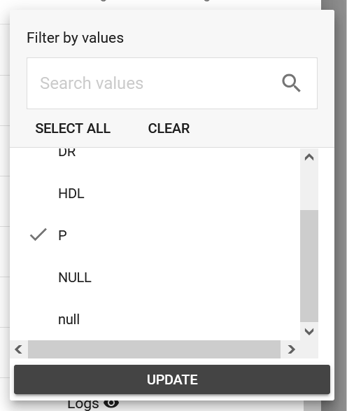
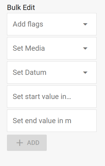
Your spreadsheet should only show data points with the P flag now. Select the checkbox at the top of the spreadsheet to select all of these data points. On the left side of the spreadsheet is a column named Bulk Edit (image below). Click the Add Flags dropdown and select DV followed by the green ADD button. Finally, save your work by pressing the green SAVE button on the lower right-hand side of the window.
Let’s switch our view to just the past year and give those datapoints preliminary flags. Filter by DateTime such that only measurements from 2021 appear, then add a P flag for those records.
There’s one more important bit about flags we should go over before moving on. Filter flags to only show records marked with “DR” (data rejected). Youll note you don’t see anything. This is because we don’t have our settings configured to show data hdiden by flags. On the left side of the spreadsheet in the Settings box, click show values hidden by flags and then filter the flags again to only show records marked with “DR.” This shows us the data that was rejected.
As a final step for this part of the tutorial, you can download the Excel Report. Exit the tabular view and click the Download Excel Report button. Once it’s downloaded, take a moment to look at the spreadsheet.
Congratulations! You’ve finished your first EnviroData tutorial. However, this is only the beginning of what you can do with EnviroData’s rich API. In the next tutorial, we’ll begin to get a better glimpse of this by looking more in depth at how to manage files and data.
See also
Learn how to do other tasks with discrete and continuous monitoring locations in the monitoring location task recipes section of the EnviroData Cookbook